 |
| Sketching Out the Design |
 |
| Begin to Add the Plants and Bottom of the Pond |
 |
| Pond Poster Finished Before Labels and Creatures |
 |
| An Example of a Pond Poster When Finished (Minus the Coloring) |
|
| Sketching Out the Design |
|
| Begin to Add the Plants and Bottom of the Pond |
|
| Pond Poster Finished Before Labels and Creatures |
|
| An Example of a Pond Poster When Finished (Minus the Coloring) |
| On Saturday, June 10, the Mohonk Preserve will be hosting their Annual Auction at the Mohonk Mountain House. Last year, I noticed that a few staff were able to donate things to the auction that they made including artwork. Me, being a competitive artist, wanted to donate something to the auction and of course, show off my artistic talents! So I wanted to submit something that reflected the Preserve. I have been admiring many of the Preserve's volunteer photographers and wanted to draw one of their drawings (as long as I got permission). Submitting a piece of art that was 1). produced by a Preserve staff member; 2). inspired by a Preserve volunteer photographer; and 3). showcased a local fauna that can be found on the Preserve...definitely reflected the Preserve in many ways. For the past month, I have worked on this drawing pretty much every night after work. It was a great brain break and it felt good to get my hands dirty with charcoal again. I definitely want to get back into my art on a regular basis and giving myself projects like this can get me back into the groove. I cannot wait to see if the auction attendees like my drawing and hope they decide to make a bid on it! TheChristyBel  |
| The Inspirational Photograph of a Spring Peeper Photo Credit to Renee Zernitsky |
 |
| Phase One |
 |
| Phase Two |
 |
| Phase Three |
 |
| Phase Four |
 |
| Finished |
 |
| Complete in the Frame |
 |
| Side Profile Portrait |
 |
| Frontal Portrait |
 |
| 3/4 Portrait |
 |
| Self Portrait |


 |
| My Finished Piece! |
 |
| Still Life |
 |
| Attempt One: Starting From a Middle Tone Adding and Subtracting Values |
 |
| Attempt Two: Defining More Values |
 |
| Final Product |


 In my Drawing I class, our first homework assignment is a 'Measured Contour Line' drawing. In class, we've been practicing still-lifes with what our instructors have set up full of odds and ends where we would draw the outline shapes in various thicknesses and pressures to capture the still-life. The process of this drawing is that you start with a rectangle representing your picture plane that encompasses the composition of the drawing. You use a view finder or a mental picture frame to create the range of what you will draw. Then you work with light gestures (something I am struggling with) that uses diagrammatic lines to sketch out the general placement of parts and scale relationships. Diagrammatic lines are the skeletal, gestural, lines that provide a transparent construction of what you are drawing. So, lines overlap even if they do not belong to the same object. You draw lines through objects and surfaces and think about constructing the objects and surfaces of the still life transparently. You can use the vine charcoal for this.
 When you are close to making a clearer layout of your drawing, you can start refining lines and line quality. This mean being specific to the edges of the objects and modifying line treatment in the inner and outer edges of forms. I have never used so much eraser before until I got to this class. (I actually need to buy more pencil eraser refills!) Erasing through refining lines create clear contours.
  |
| Looking Through the View Finder |
 |
| This Was My First Attempt |
 |
| This Was My Second Attempt (With More Cross-Hatching) |
 |
| The Finished Product |
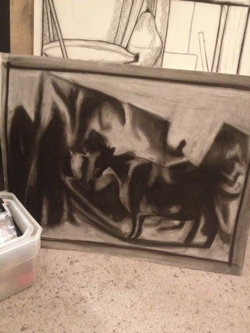 Today we learned about values and shading! My favorite part of drawing! This was a super cool exercise we did. You cover your entire paper in a middle tone gray (mostly vine charcoal and maybe a layer of compressed charcoal). Then we examined a photo placed on the projector. Originally, the photo we were going to be drawing from appeared incredibly blurry. But the objective of the class was to not draw exactly what we saw, but to focus on the various intensities of dark and lightness. So, we use compressed charcoal to emphasize really dark areas (additive areas) and then use our erasers to emphasize really light areas (reductive areas). After each session, our instructor would focus our photo more and more until he showed us the focused picture. It was really cool. Our instructor stated that if he just shown us the picture, we would go straight to one object (can you guess it would be the cow on the bottom right) and not focus on anything else. He wanted us to capture the dark, light, and middle tones of the image first. This drawing is not done, but it was pretty interesting to make. I kind of like it unfinished!
 |
| The Teton Views |
 |
| Learning to Draw Plants |
 |
| Finished a Mammal Resource Page The Snowshoe Hare |
 |
| Found This at a Bar-Be-Que Huge Tires for a Snow Bike Notice the Tye-Dye Paint Job! |
 |
| Also Notice the Flipper Fender! Want! |
 |
| It's April...and We Get MORE Snow! |
 |
| A Surprise Gift From My Cousin, Jessica! She Knows Me So Well! |
 |
| Oh You Know, Drawing Some Local Birds Around Campus |
 |
| A Pika Skull - Lagomorphs (Rabbits & Pikas) have latticed skulls! |
 |
| Pika Skull - Only 2.5 inches long! |
 |
| Dolphin Skull! |
 |
| Drawing a Beaver Skull! |

